RED HOOK: Publishing House Branding
For this project, I developed a brand for Red Hook, a made-up indie publishing house specialising in the re-editing of old classics of the horror and sci-fi genre, giving them a new life in a completely different world to the one in which they were conceived. My main objective was to have cultural critique in mind, for a Gen Z/young Millenial audience.
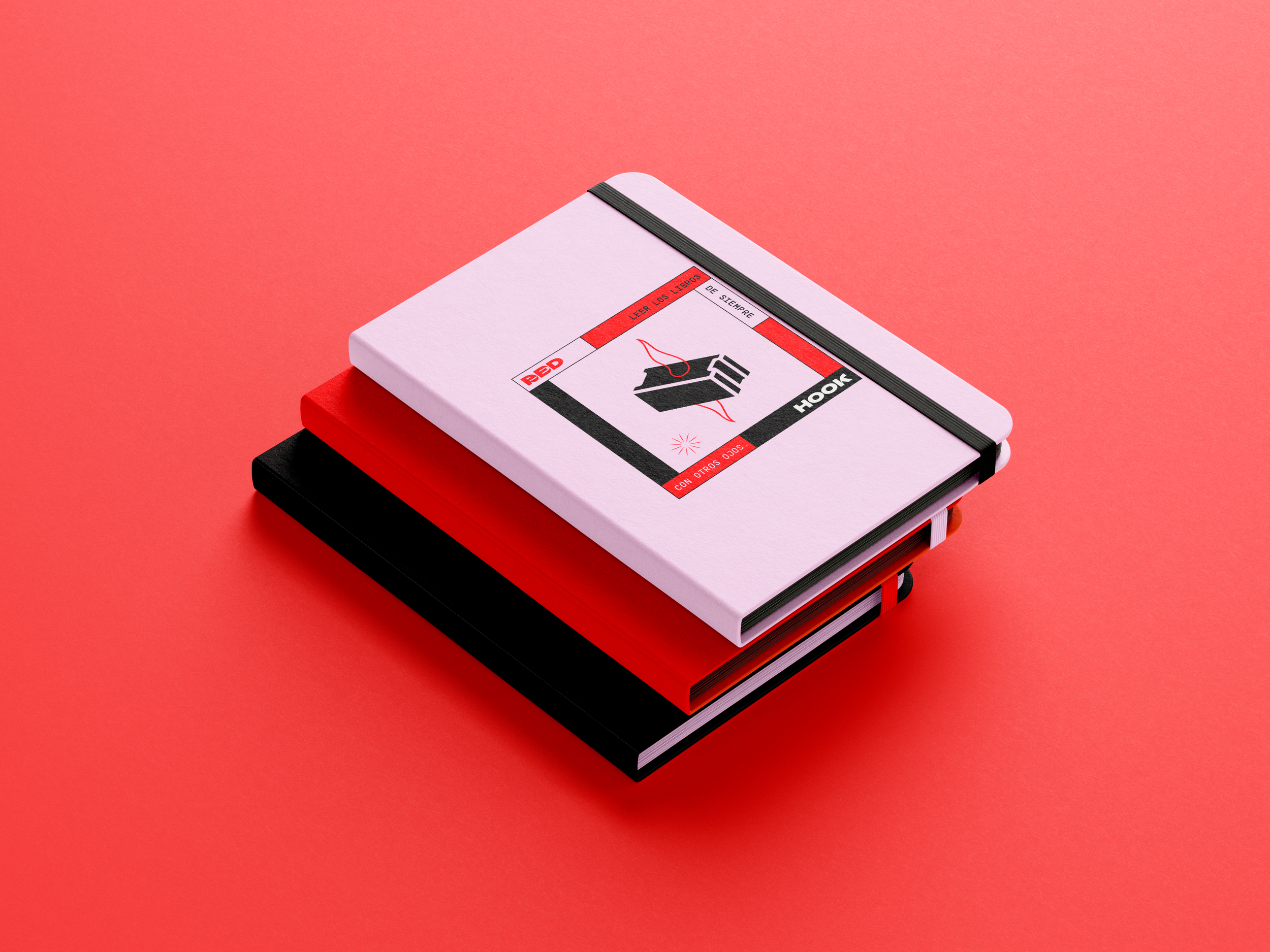
I created this logo using the insanely cool type Yokai from Off Type Foundry and based my symbol on ordinary things (like a brick) being speared by magic/fantasy. As the name of the publisher is based on a story by H. P. Lovecraft, the tentacle-looking ‘magic’ seemed appropriate.